Brand Fonts
Typography is an essential element that helps communicate a unified look and distinctive brand personality.
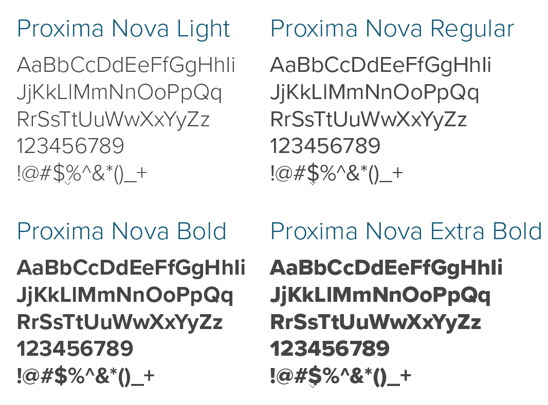
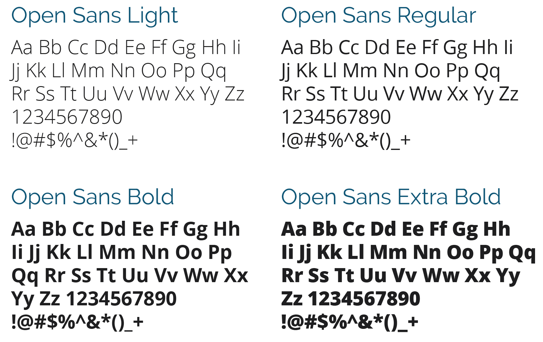
Proxima Nova is the primary typeface of University of Wisconsin Extended Campus. It should be used whenever possible on all branded materials. Open Sans is a font used for secondary use applications.
LICENSING AND USE
This Font Software is licensed under the SIL Open Font License, Version 1.1.
This license is available with a FAQ at: http://scripts.sil.org/OFL
If you absolutely can not gain access to Raleway use Verdana (Regular and Bold) as a last resort. Verdana is a system font that is available on all PC and Mac systems and web safe.
WEB FONTS
Proxima Nova is not available as a web font in Google fonts. Montserrat is our default Web Font to be displayed as a web font for headings, subheads, and call to actions. Open Sans will be the font choice for all paragraph styles. Verdana should be used for web materials only when a font replacement technique for Montserrat is absolutely not possible.
CASE
Sentence case is always preferred for long from body copy. Sentence case means only the first letter of the first word in a series of words is capitalized. This keeps our brand more conversational as well as improves legibility. It is recommended that all caps is used for headlines, subheads, and calls-to-action when it’s written in the context of a sentence.
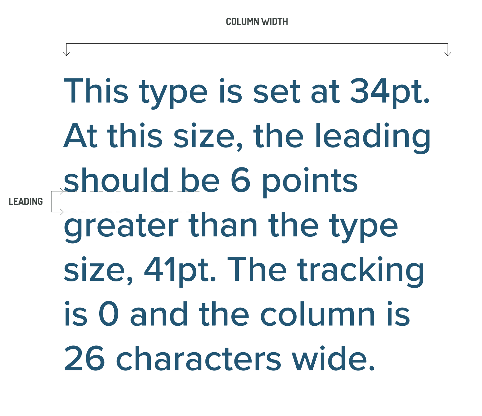
LEADING
Leading is the space between lines of type. When type is below 16pt., leading should be 6 points greater than the type size. Above 16pt., leading should be 5 points greater than the type size.
TRACKING
Tracking is the space between letters. Never set type with less than 0 tracking. Letters should never touch each other.
COLUMN WIDTHS
It is important that the width of a column of type is optimal for legibility. Column widths greater than 70 characters or less than 20 should be avoided.
SECONDARY FONT USAGE
Paragraph text in web applications should be set to Open Sans, all body copy in print and/or digital applications should also be set in Open Sans.
MICROSOFT OFFICE APPLICATIONS
The font Calibri is the preferred font when working with Microsoft Office applications when licensed fonts are not available.
DOWNLOADS
All weights of Proxima Nova are available in Adobe’s Creative Cloud and Open Sans are available as downloads from Adobe Creative Cloud and Google fonts.