Logos
The UW Extended Campus program brands have been folded into the UWEX identity. In doing so we have simplified colors, typography, and any other elements to create a cohesive brand.
There are different options for using each program’s visual identity, as a stand alone brand, the logos must call out University of Wisconsin, if used under the UWEX umbrella and with other programs it will display as the program alone. Also included are degree level options when we are specifically promoting the degree level of a program.
If heading a document with University of Wisconsin or the UW Extended Campus logo the type treatment is available in the logotype. If using one or several campus names to head a document, use the University of Wisconsin logotype,
Most applications will include the program powered by University of Wisconsin Extended Campus mark.
Primary Use Logo(s)
The main logo for the Information Technology Management program is the horizontal version.
The logo should be scaled proportionately, graphic elements and tag lines should not be altered out of proportion to the logo.
Downloads are available in jpg, png, and vector. A description of usage for each is listed below.
jpg: Solid background for use in web and other digital applications.
png: Transparent background for use in web or other digital applications.
vector: Scalable, vector based image, used as a smaller download size for both print and web applications–the download includes eps and svg files.
Color Palettes
Primary Colors
The primary colors for Information Technology Magement are Pantone 7701* (blue), Pantone 7625 (orange), Pantone 142 (yellow) and Pantone 377* (green), and Pantone 651* (light blue) as seen in the logo.
*Orange, Dark Blue, Green, and Gray are standard colors in all collaborative program identities.
**Websites use #444444 gray for text and other consistent applications.
***Pantone 5493 (light blue) is an additional color used in creating a connection to the CEOEL identity.
# RGB and Hex colors have been adjusted to pass color contrast ratio standards, when in doubt of color contrast ratios please enter hex values into the color WebAIM Contrast Checker.
! Lighter colors should not be used as backgrounds to white type.
-
Pantone 7701 96 C 0 R 62 M 87 G 35 Y 119 B 15 K #005777 -
Pantone 7625 3 C 212 R 84 M 68 G 82 Y 39 B 0 K #d44427 -
Pantone 142 4 C 244 R 27 M 189 G 83 Y 21 B 0 K #f4bd15 -
Pantone 377 48 C 148 R 10 M 184 G 100 Y 54 B 0 K #94b836 -
Pantone 651 33 C 168 R 15 M 194 G 8 Y 213 B 0 K #a8c2d5 -
Pantone 446 67 C 68 R 60 M 68 G 59 Y 68 B 44 K #444444
Secondary Colors
The secondary colors are accent colors pulled from the brights palette.
-
-
GRAPEFRUIT Pantone 198 1 C 237 R 82 M 84 G 49 Y 102 B 0 K #ed5466 -
GRAPEFRUIT Pantone 710 10 C 217 R 88 M 69 G 63 Y 84 B 1 K #d94554
-
-
-
BITTERSWEET Pantone 7416 0 C 252 R 71 M 110 G 69 Y 82 B 0 K #fc6e52 -
BITTERSWEET Pantone 7625 3 C 232 R 81 M 87 G 81 Y 64 B 0 K #e85740
-
-
-
SUNFLOWER Pantone 122 0 C 255 R 18 M 207 G 86 Y 61 B 0 K #ffcf3d -
SUNFLOWER Pantone 142 3 C 245 R 28 M 186 G 85 Y 66 B 0 K #f5ba42
-
-
-
GRASS Pantone 367 40 C 166 R 4 M 199 G 88 Y 79 B 0 K #a6c74f -
GRASS Pantone 377 48 C 148 R 10 M 184 G 100 Y 54 B 0 K #94b836
-
-
-
MINT Pantone 3385 62 C 71 R 0 M 207 G 44 Y 173 B 0 K #47cfad -
MINT Pantone 7465 69 C 56 R 0 M 189 G 51 Y 156 B 0 K #38bd9c
-
-
-
SKY Pantone 297 49 C 117 R 4 M 199 G 3 Y 232 B 0 K #75c7e8 -
SKY Pantone 2915 62 C 84 R 12 M 178 G 7 Y 217 B 0 K #54b2d9
-
-
-
BLUE JEANS Pantone 279 60 C 92 R 32 M 156 G 0 Y 237 B 0 K #5c9ced -
BLUE JEANS Pantone 2718 69 C 74 R 41 M 138 G 0 Y 219 B 0 K #4a8adb
-
-
-
LAVENDER Pantone 2655 37 C 172 R 44 M 145 G 0 Y 237 B 0 K #ac91ed -
LAVENDER Pantone 2665 47 C 150 R 56 M 122 G 0 Y 219 B 0 K #967adb
-
-
-
PINK ROSE Pantone 673 3 C 237 R 58 M 135 G 0 Y 191 B 0 K #ed87bf -
PINK ROSE Pantone 674 12 C 214 R 69 M 112 G 0 Y 173 B 0 K #d670ad
-
-
-
LIGHT GRAY Pantone 663 3 C 245 R 1 M 247 G 1 Y 250 B 0 K #f5f7fa -
LIGHT GRAY Pantone 7514 8 C 229 R 5 M 232 G 3 Y 237 B 0 K #e5e8ed
-
-
-
MEDIUM GRAY Pantone 538 19 C 204 R 12 M 209 G 9 Y 217 B 0 K #ccd1d9 -
MEDIUM GRAY Pantone 429 34 C 171 R 24 M 178 G 29 Y 189 B 0 K #abb2bd
-
-
-
DARK GRAY Pantone 431 63 C 102 R 50 M 110 G 42 Y 120 B 13 K #666e78 -
DARK GRAY Pantone 446 67 C 68 R 60 M 68 G 59 Y 68 B 44 K #444444
-
Typography
Typography is an essential element that helps communicate a unified look and distinctive brand personality.
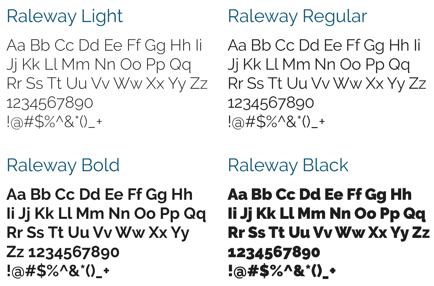
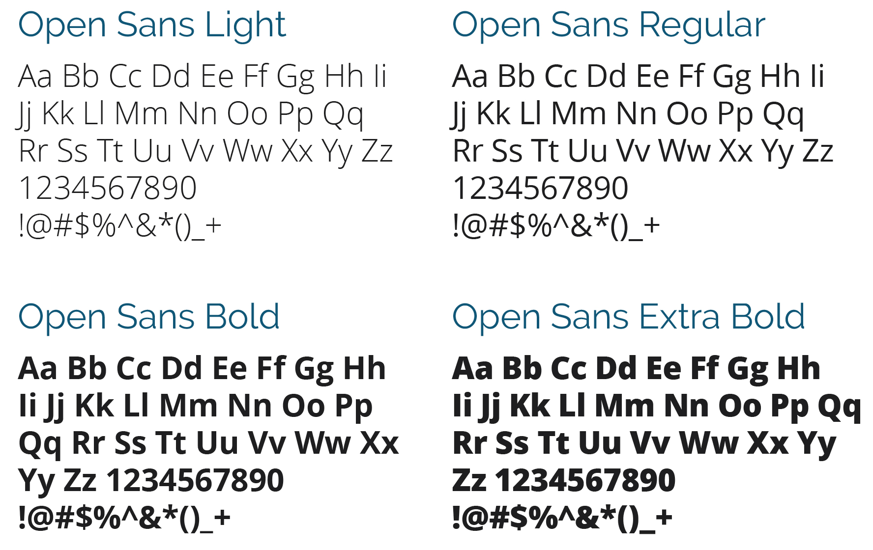
Raleway is the primary typeface of University of Wisconsin Data Science. It should be used whenever possible on all branded materials. Open Sans is a font used for secondary use applications.
LICENSING AND USE
This Font Software is licensed under the SIL Open Font License, Version 1.1.
This license is available with a FAQ at: http://scripts.sil.org/OFL
If you absolutely can not gain access to Raleway use Verdana (Regular and Bold) as a last resort. Verdana is a system font that is available on all PC and Mac systems and web safe.
WEB FONTS
When possible, online applications should use a font replacement technique that allows Raleway to be displayed as a web font for hfeadings, subheads, and call to actions. Open Sans will be the font choice for all paragraph styles. Verdana should be used for web materials only when a font replacement technique for Raleway is absolutely not possible.
CASE
Sentence case is always preferred for long from body copy. Sentence case means only the first letter of the first word in a series of words is capitalized. This keeps our brand more conversational as well as improves legibility. It is recommended that all caps is used for headlines, subheads, and calls-to-action when it’s written in the context of a sentence.
LEADING
Leading is the space between lines of type. When type is below 16pt., leading should be 6 points greater than the type size. Above 16pt., leading should be 5 points greater than the type size.
TRACKING
Tracking is the space between letters. Never set type with less than 0 tracking. Letters should never touch each other.
COLUMN WIDTHS
It is important that the width of a column of type is optimal for legibility. Column widths greater than 70 characters or less than 20 should be avoided.
SECONDARY FONT USAGE
Paragraph text in web applications should be set to Open Sans, all body copy in print and/or digital applications should also be set in Open Sans.
MICROSOFT OFFICE APPLICATIONS
The font Calibri is the preferred font when working with Microsoft Office applications when licensed fonts are not available.
DOWNLOADS
All weights of Raleway and Open Sans are available as downloads from Google fonts.
SaveSave
Program Imagery
Photography
For in-house photography options, see the UW Extended Campus photography section.
Stock Photography
The following sites are stock photography sites with free content. Please review any licensing and use agreements before using this photography.
Presentations
Presentations
The Information Technology Management presentation theme is available in two sizes: the traditional 4:3 format, and the modern 16:9 format. It is important to know ahead of time how the final presentation will be displayed. Widescreen formats such as 16×9 are becoming more popular for projectors, TVs, and computer monitors, but it is best to know for certain what type of screen will be used. The slides will appear with black bars on the top and bottom or the sides if the aspect ratio of the presentation differs from that of the screen on which it is presented.
Tutorial
Need some help using the presentation theme? Check out the tutorial.